Jean’s Greens: A proposed website redesign for a beloved herb store in upstate New York
Project Overview
Jean’s Green is a trusted and reliable herb store in upstate New York, with very loyal customers. But during the pandemic, people started buying herbs online and are looking for the same ease and reliability online while also shopping local. In this project, I am designing an easy-to-use and informative e-commerce experience that translates what the business stands for, which is community, transparency, and reliability.
My Goal
My goal as a designer was to make Jean’s Greens e-commerce site more user-friendly by studying and understanding their user’s needs. Apart from user experience, I felt that this would improve sales as well as reduce the clarifications/ extra information requests that come via email and phone calls to the business. As someone who is interested in herbal medicine myself, this was a project I was looking forward to!
Client
Jean’s Greens Concept Project
Role
UX Researcher + Designer
Duration
2 weeks
Tools Used
Figma, Miro, Canva, Google (Forms+Sheets+Slides)
DISCOVER
Research Plan
User Surveys
User Interviews
Contextual Inquiries
Competitive Analysis
User Survey Findings
Some more learnings from the survey results were :
Knowing that majority of the users surveyed bought from local store’s e-commerce websites, I knew that these were the target users of Jean’s Greens.
Also knowing that 80% grew herbs themselves, I knew that most of these users had some knowledge of herbal products and I could recruit them for interviews.
I got a very good overview of the competition
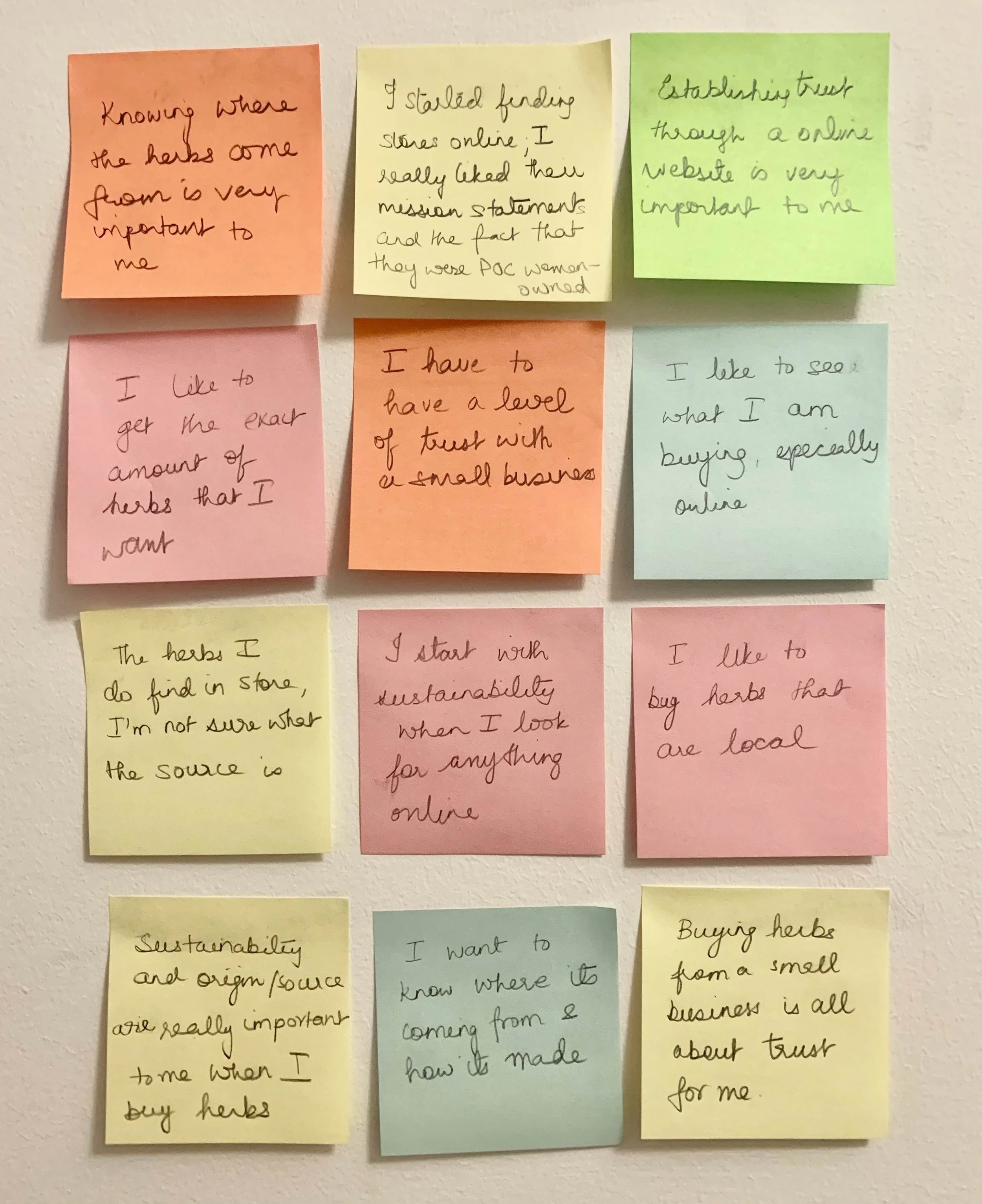
2. User Interview Findings
3. Usability Testing & Contextual Inquiries
Interesting learning
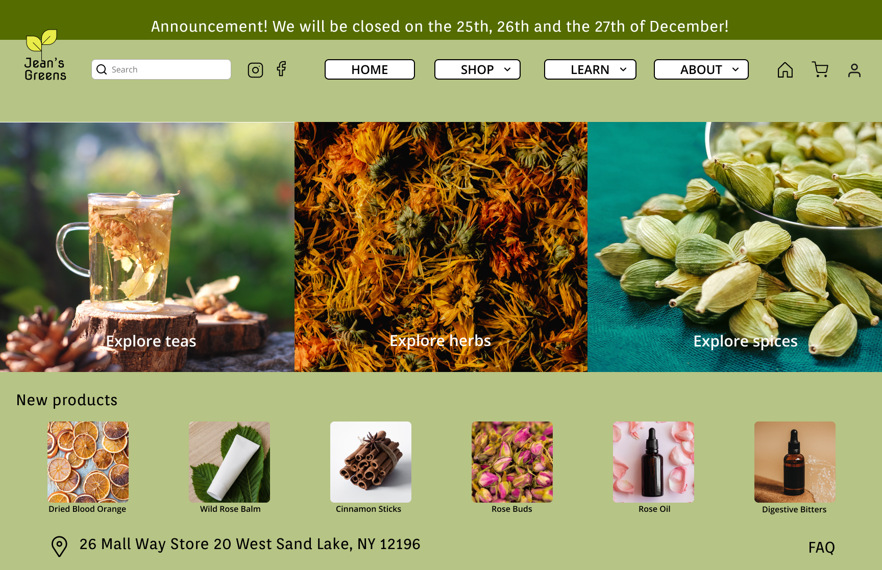
Apart from the other learnings, one very interesting learning was that every one of the users loved the green (hex b6c485) that was used on the current website. I didn’t ask them about it specifically but they mentioned it independently. They used words like soothing, calming, and natural to describe it. I chose to use this same shade in my prototype, even though as you can infer by now, I tend to lean towards much brighter shades. It was great learning for me to be able to understand and make design choices that were rooted in the user’s experience!
Let’s take a look at Jean’s green current website below!
⇩
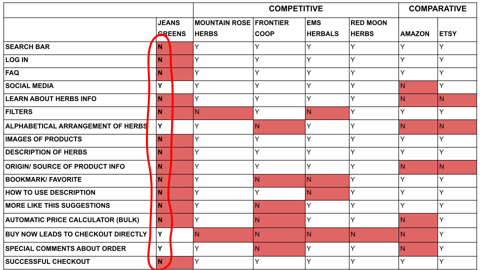
4. Competitive & Comparative Analysis
Interesting learnings
Jean’s greens current website doesn't have 13 out of the 17 features that were compared
Local stores (like redmoonherbs and emsherbals) have almost all the features addressed
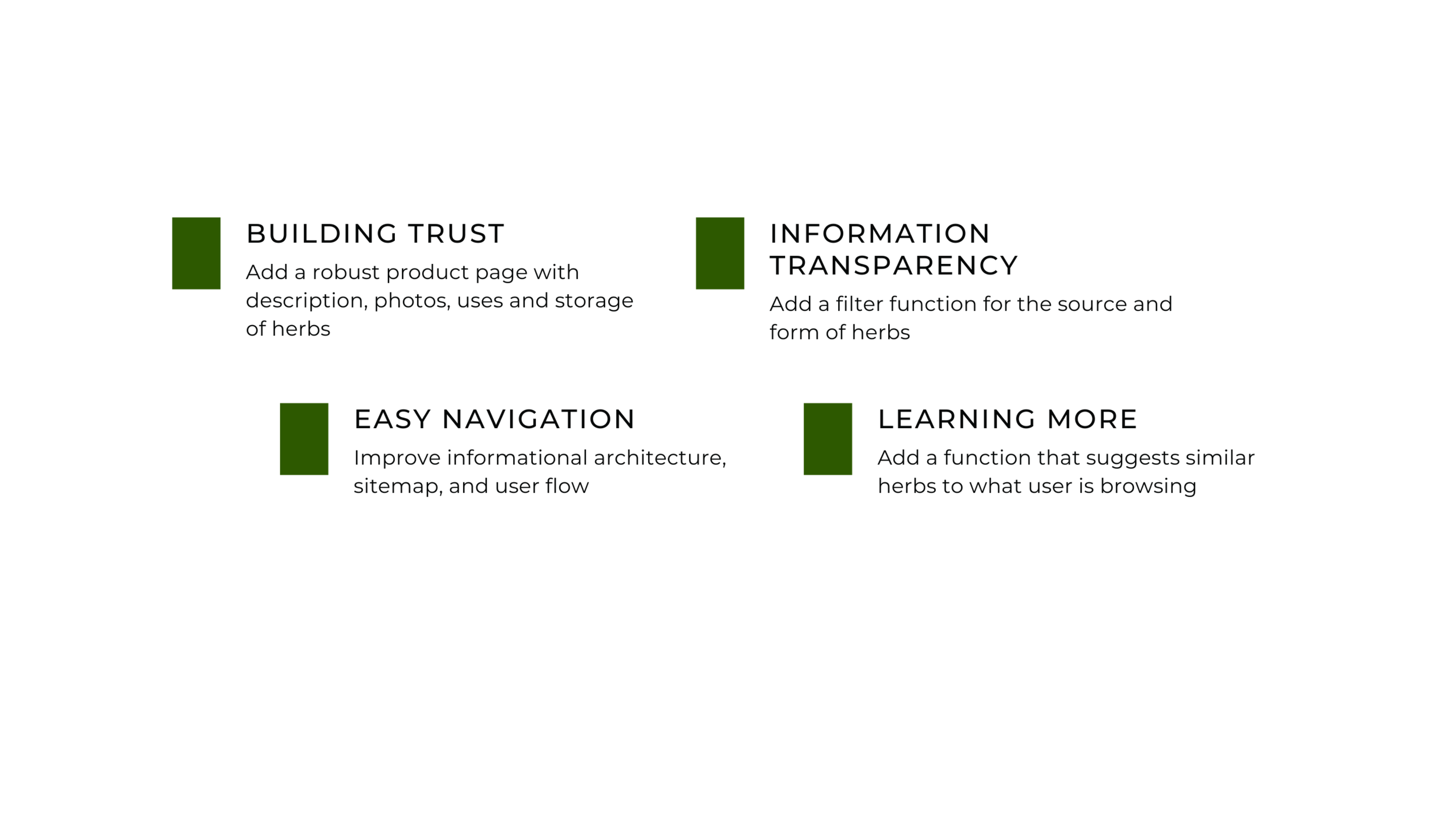
From all the research I understood the 4 most important goals for users
DEFINE
“Due to the pandemic, I started to buy my herbs online”
Maia’s problem
Maia wants to buy locally sourced herbs but unfortunately, there are no herb stores near where she lives. Upon research, she found out about Jean’s greens, a herb store in upstate, and wants to shop online with them. Maia needs to build trust in terms of information, transparency, and sourcing practices with Jean’s greens online store so that she can buy from them and continue on her journey to holistic health.
and How Might We?
How might we make Maia’s experience of shopping for herbs online easier, informative, and visually enticing?
How might we build trust through the transparency of information on the website?
How might we give Maia an easy experience navigating and finding herbs that help her, while also having her learn about new ones?
Maia’s experience with a storyboard ⇩
I understood after defining Maia and her needs, that I was to solve for three main things:
Building trust through transparency and accessibility of information
Ease of use and navigation
Build on a learning experience
DESIGN
Design Plan
User Flow
Sitemap
Sketches
Wireframes & Prototypes
Usability Testing
User Flow Evaluation & Design
-
Current User Flow
In this user flow there were many points at which the user gets frustrated and or/ leave (indicated below in red)
The source/ form of herb was small and easily overlooked
When users cannot click on herbs to find more information/ images
Adding an item in cart would lead to cart straightaway
The credit card function did not work

-
Proposed User Flow
In the new proposed user flow, the pain points in the sitemap were addressed so that user would be able to complete the task:
Proposed a filter function on product listing page
Proposed to design a robust product page
Proposed a function to automatically calculate price
Proposed a shopping cart updated function
Proposed a straightforward checkout process

Sitemap Evaluation & Design
-
Current Sitemap

-
Proposed Sitemap

Sketches
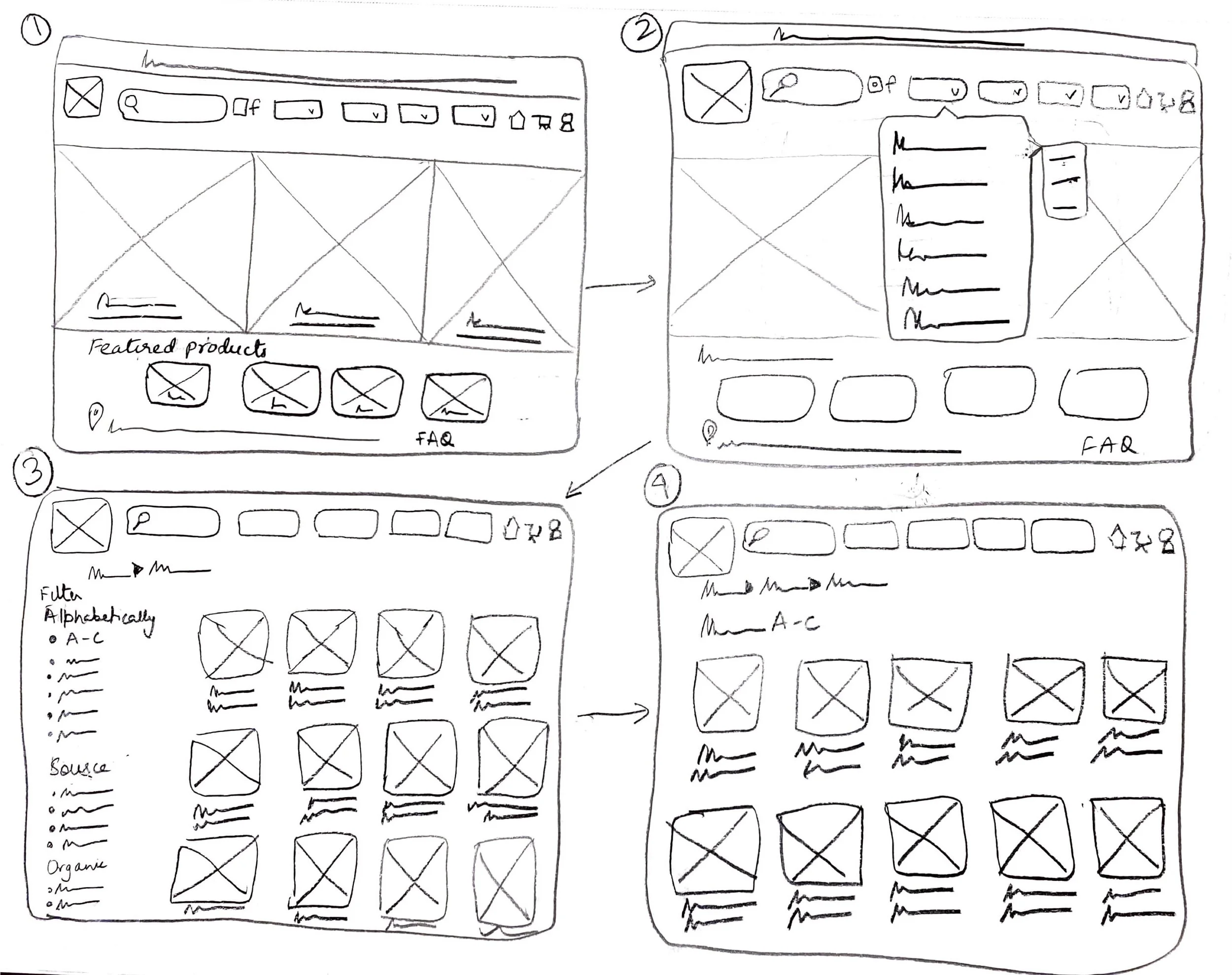
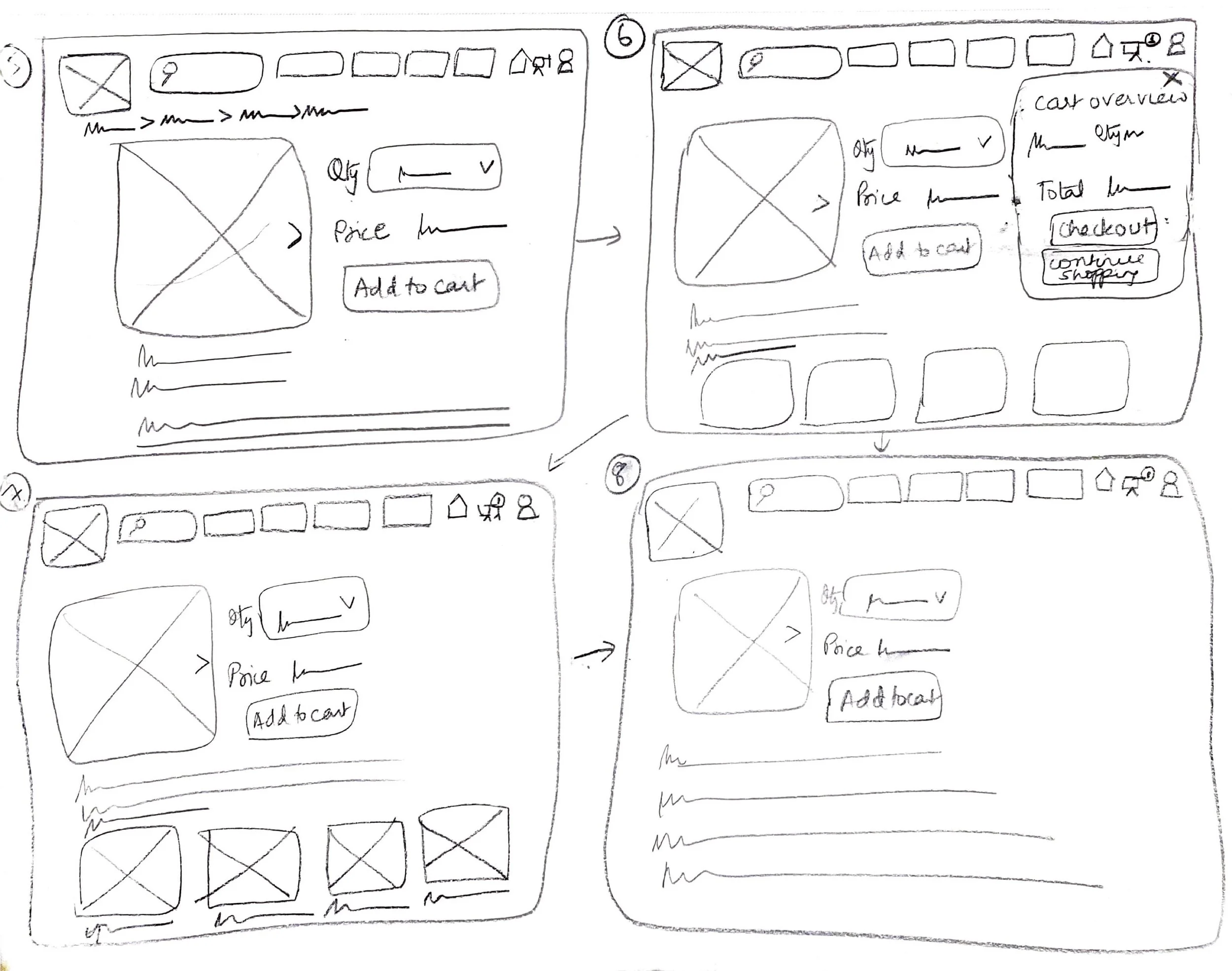
Once I had the user flow I wanted to translate and a sitemap that gave me a better idea of the structure of navigation I came up with initial hand sketches for the main pages like the homepage, product page, product listing page, and checkout.
Wireframes
I then proceeded to create wireframes from the hand sketches.
Low Fidelity Prototype Usability Testing and Results
Task:
Buy 2 bulk herbs
Organic herb whole- 1oz by using filters
Continue shopping
Another herb whole 1oz- based on suggestions once you add herb 1 to cart
Then checkout herb 1 and herb 2 till the end
What I found:
Next, I added and corrected the design further into a mid-fidelity prototype.
Below were some of the changes I made:
added the filter again on the already filtered page so the user could edit and add
Added the functionality of choosing multiple sources
Added a border around the cart overview overlay so it didn’t merge with the rest of the page
A look at the progression of the design to Mid Fidelity
Filter function
-

Current website
The current website has no option to filter
-

Low Fi Prototype
While this had a filter on the original product listing page, once filtered that feature was no longer there
-

Mid Fi Prototype
After the usability test, I incorporated the filter function again on the already filtered page so users can edit or change their preferences if needed.
Source Filter function
-

Current website
The current website has a blurb of abbreviations at the top of the page in a very small font and most users missed it.
-

Low Fi Prototype
I added the filter for source apart from the alphabetical one
-

Mid Fi Prototype
After the usability test, I incorporated choosing multiple sources to accommodate a hybrid preference. I also learned that these should be checkboxes.
Cart Overview function
-

Current website
The current website has no cart overview. Anytime you add an item to the cart the user reaches the shopping cart directly and has to navigate back to the homepage
-

Low Fi Prototype
I added the cart overview overlay with the option to checkout or continue shopping so the user could make that choice
-

Mid Fi Prototype
After the usability test, I incorporated the outline around the cart overview overlay as in the low fi prototype the cart merged into the page and confused users
Mid Fidelity Usability Testing and Results
Next, I added and corrected the design further into a high-fidelity prototype.
I added images and more information on herbs and further refined the product to a closer-to-real website design.
And finally, you can see the prototype here!
⇩
Learnings
I learned how to create a website; keeping in mind all the nuances and insights from research and the persona
I also learned that the best answer to overcoming design challenges was always to go back to the research and listen closely to the users
One of the biggest surprises from my research process was how overwhelmingly supportive the online communities are to share and engage. I am very glad that I went outside my comfort zone and tried it. I now treat it as a collaboration, not a tool
The biggest challenge in this project was the short span of two weeks. I wanted to make sure that I was talking to enough and the target users and also testing the prototype thoroughly. However, scheduling and conducting these interviews and tests took a lot of organization, time, and effort

