Billing Tickets: Simplification and Redesign
The Problem
Owing to legacy systems and historic acquisitions, the billing system had a lot of issues including no real-time payment updation, slow page performance, inconsistency in billing information, invoices not getting updated, invoices not being downloadable, and billing of erroneous amounts among others. This led to many Billing Tickets in the Control Center Portal from customers asking to resolve their issues. Billing-related tasks were also the primary reasons our users came to the Control Center
Due to an old and hard-to-use design for submitting billing tickets, users often found it hard to submit the ticket for the correct reason. Of the 34 reasons total, most users just chose the first 2 reasons 80% of the time. This led to a lot of back and forth with customer support to pinpoint the accurate reason so the user’s issue could be directed to the right team to be solved—this increased time to resolution significantly, leading to further friction for an already frustrated user.
My Goals
To design a simple and intuitive billing ticket selection and submission design, so users could open tickets for accurate reasons and their issues could be resolved quickly and effortlessly
To drive consistency within the Control Center ticketing system design so users would not have to learn and use two significantly different designs within the same portal
Influencing stakeholders from several billing systems to relook at the amount of information they need for their specific billing tickets from the users and only ask for the really necessary information
Influencing stakeholders to relook at several ticket types and eliminating ones that no longer were relevant or could be incorporated with another ticket type
Client
Billing
Role
UX Researcher + Designer
Duration
3 months
Tools Used
UX Pin, Miro, Powerpoint, Content Square, Qualtrics, Excel
Existing design for submitting Billing Requests
Landing Page for the user on Control Center
Creating a new Billing Request
Step 1: Finding the type of Billing Request using a combination of radio selection and related dropdown
Problem with Step 1: By studying the data of the billing requests received in the past 1 year in addition to user sessions on Content Square and analyzing feedback on Qualtrics, we saw that users picked Billing Request types at random, usually the first 1 or 2 in every option which led to significant back and forth between support and the users to get to the right team for issue resolution. The time to resolution was high due to the time that went into issue identification
Step 2: Filling out and submit a form with many required and some optional fields
Problem with Step 2: By studying user sessions on Content Square and analyzing feedback on Qualtrics, we observed that
Users often abandoned the form halfway because they either didn’t have the required information, entered the incorrect information, or looked for a shorter form in a different request type
The validation of these fields all at once when the user clicked submit, which led to user frustration after filling out a lengthy form.
Current Billing Requests Structure
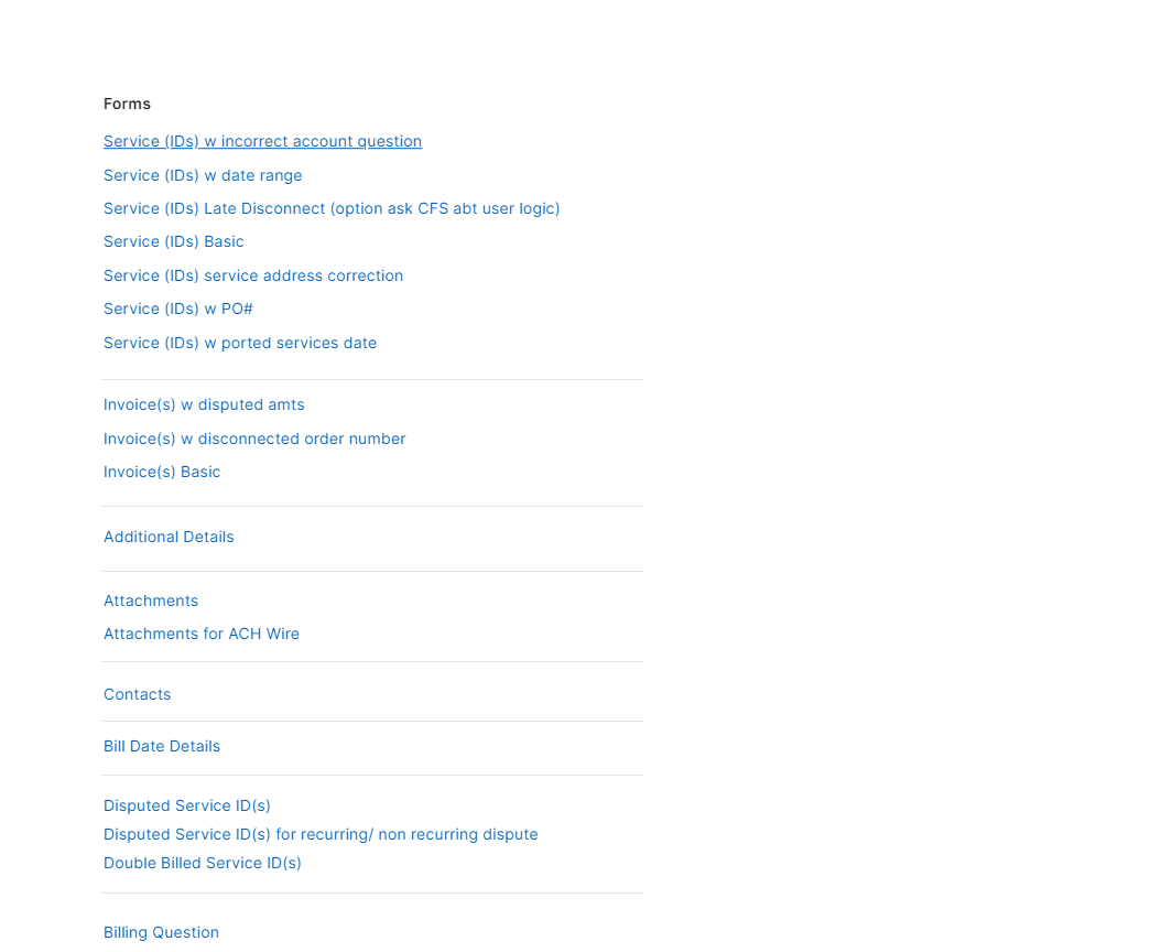
The current structure had 34 Billing Request types related to 5 types of broader issues
While each of these had to be audited and simplified, there were some very clear areas of improvement like
Similar sounding Requests without any explanation of how they are different. For example, Understanding if users understood the difference between “Double Billing” and “Incorrect Amount Billed”. Both of these also asked the user for almost similar information
Non-user-friendly terminology- For example, understanding if the users understood the difference between Billing Account Name and Legal Account Name like the stakeholders did
Usability Testing
We also conducted unmoderated user testing on the current design with a specified task to see how the users picked the billing request types. 14 of 15 users failed to complete the task and picked the incorrect request type
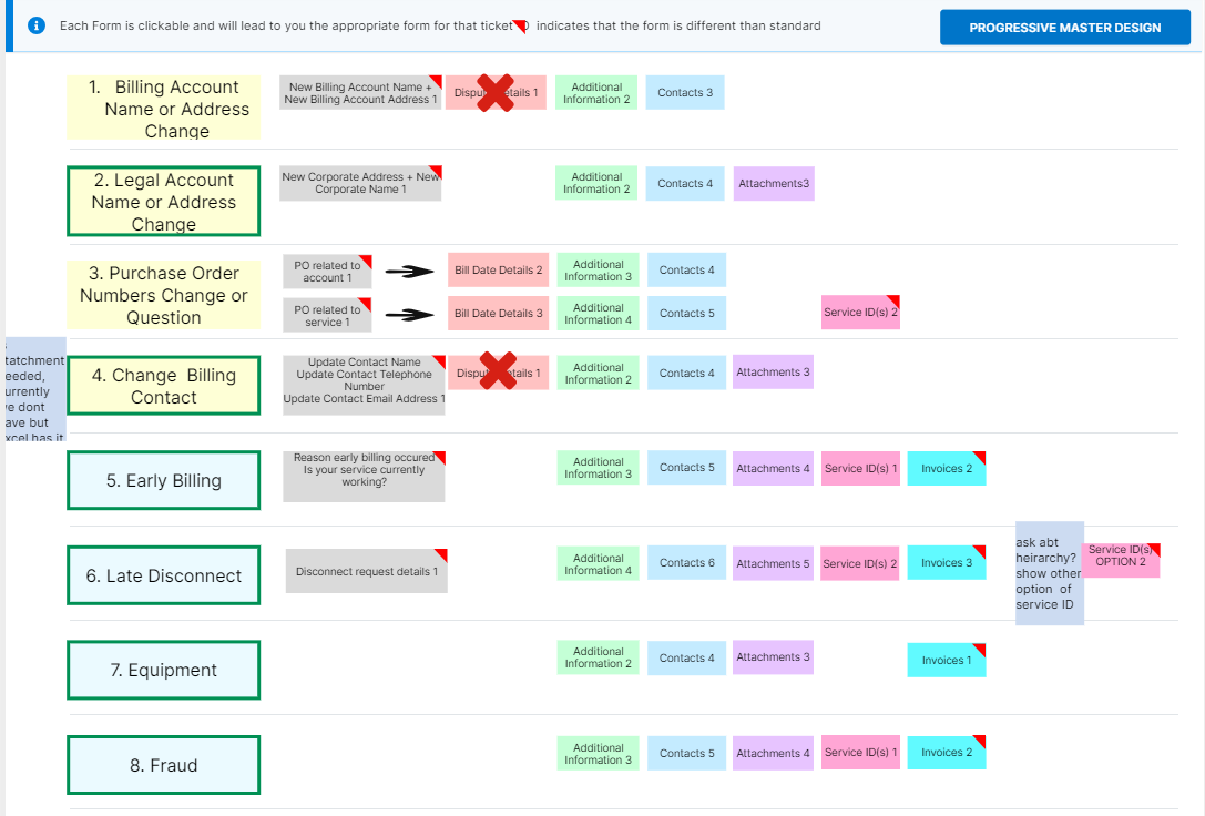
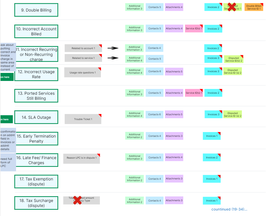
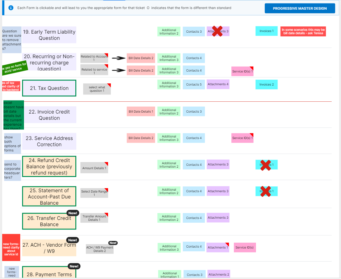
Before we started redesigning we wanted to bring all the stakeholders to the table to audit the the current 34 Billing Requests in detail along with the information that is required of the user for each one
Audit & Requirements
The audit took a month to complete due to a large number of stakeholders (~20) from different billing systems, and multiple support teams coming together. The product manager and I collaborated on this.
The goal of this audit was to
Reduce the number of types of Billing Requests. With how many wrongly labeled billing requests we got and how cumbersome it was for the support team to coordinate between users and stakeholders to get tickets directed correctly, this was the first step to understanding and consolidate
Adding new Billing Requests that are worthy of addition after observing the data on the types of tickets we get. Gathering requirements for these was also done at this step
Reduce the required and optional information we wanted from the users to only the most essential to resolve an issue. This was met with most pushback because many stakeholders insisted on keeping all fields and were wary of letting go of information they were used to getting.
Renaming for Portal-wide consistency
One of the solutions was to integrate billing requests with the ticketing system on the rest of the portal like admin issues, network issues, etc however while this was something that was a long-term objective for the support team, the back-end system supporting billing requests was a completely different one. This issue was part of legacy systems and mergers and acquisitions that had led to a complex soup of multiple billing systems
Since the integration wasn’t possible, we wanted to at least bring the naming convention to par with the rest of the portal where when the user requested issues to be resolved they were labeled “Tickets”. We decided that we should rename “Billing Requests” to “Billing Tickets”
This is why in the entire redesign you will see this change reflected.
New and Revised Billing Tickets structure
After our collaboration and audit sessions, we got to 28 total tickets down from 34, 3 of these were net new. This was the most challenging part of the project, getting stakeholders together, auditing each section in detail, asking the tough questions, the why’s, the what’s and finally influencing the stakeholders to see the value and time benefit for them in simplifications of the tickets, in addition to the significant benefit and ease this would bring to the users
Two-part Redesign Effort
Once we had the billing structure ready, this was a 2 part redesign effort:
Step 1: Redesigning the step where the user searcher for and finds an appropriate Billing Ticket
Step 2: Redesigning the form where the user fills and submits the Billing Ticket
Both these could be designed and developed separately. Since there were budget constraints and because development was already familiar with the progressive form design, we prioritized implementing Step 2 first
Step 2 Redesign: Filling and submitting the Billing Ticket form
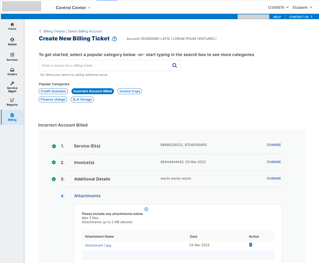
After doing a competitive analysis and studying the portal-wide ticket selection system, we landed on a progressive form design
The reasons we landed on this design
Drive consistency with the portal-wide ticketing experience
It offered the extensibility to remove sections if needed after we iterated and learned more
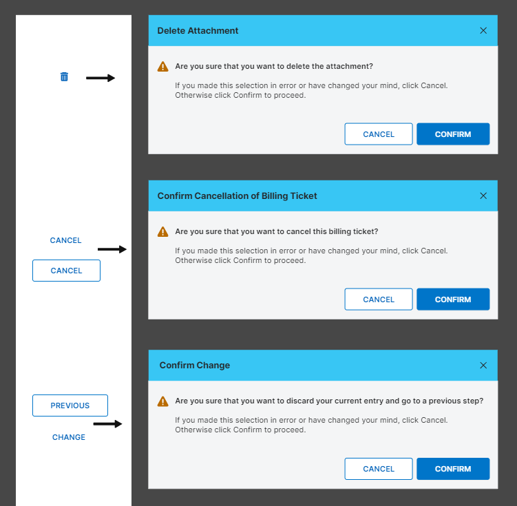
It offered step-by-step validation
This design asked for digestible portions of information at a time instead of an overwhelming long form
Usability Testing
We tested the progressive form with 12 users in an unmoderated test and all of them were able to move through, make changes and submit a Billing Ticket successfully
Step 1 Redesign: Searching and selecting a Billing Ticket
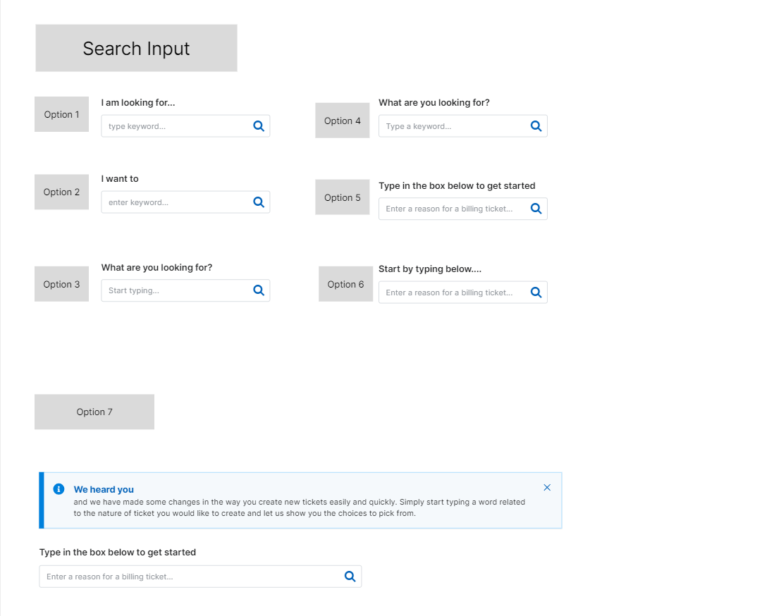
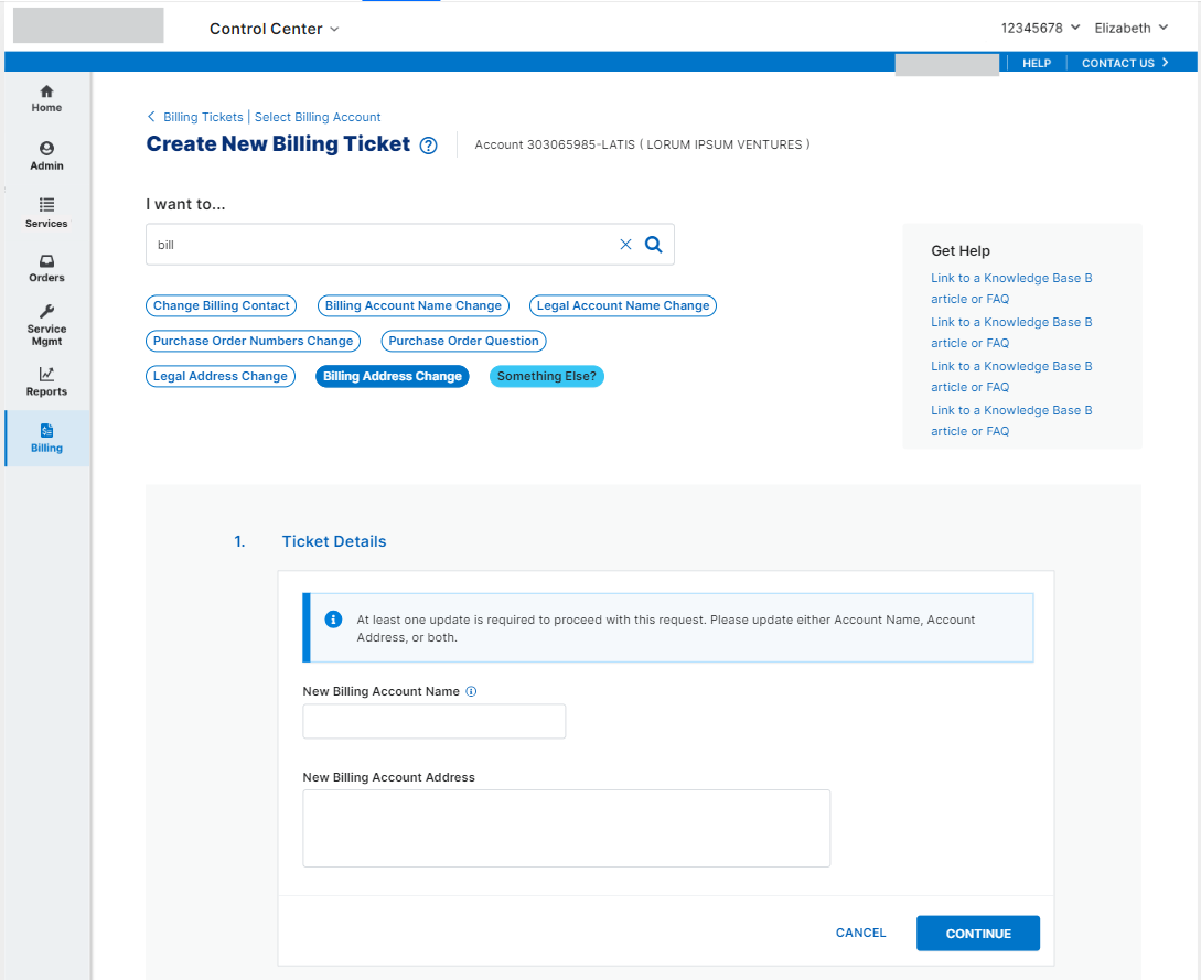
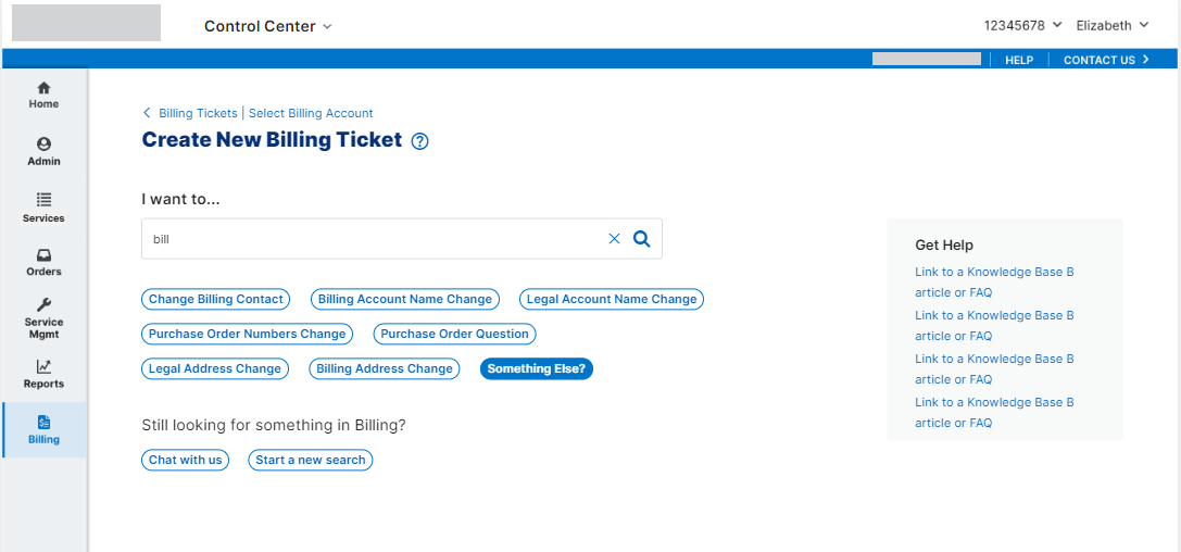
After doing a competitive analysis and studying the portal-wide ticket selection system, we landed on a smart search concept. The portal currently didn’t have a global search concept and it was a future goal to add smart search, possibly AI-powered.
The reasons we landed on this design
We wanted to make it easier for our users to find and submit a ticket for the right reason so they could get their issues resolved quickly
We also wanted the user to take the lead in explaining their problem in simple words to us, and for us to do the work of understanding them instead of the user having to decipher our complex jargon and terminology
We wanted to help users self-solve issues by either chatting with us or by using a knowledge base article instead of having to submit a ticket
And lastly, we wanted to incorporate AI and push the envelope for the portal


