Developer Center: A platform for APIs and documentation
Project Overview
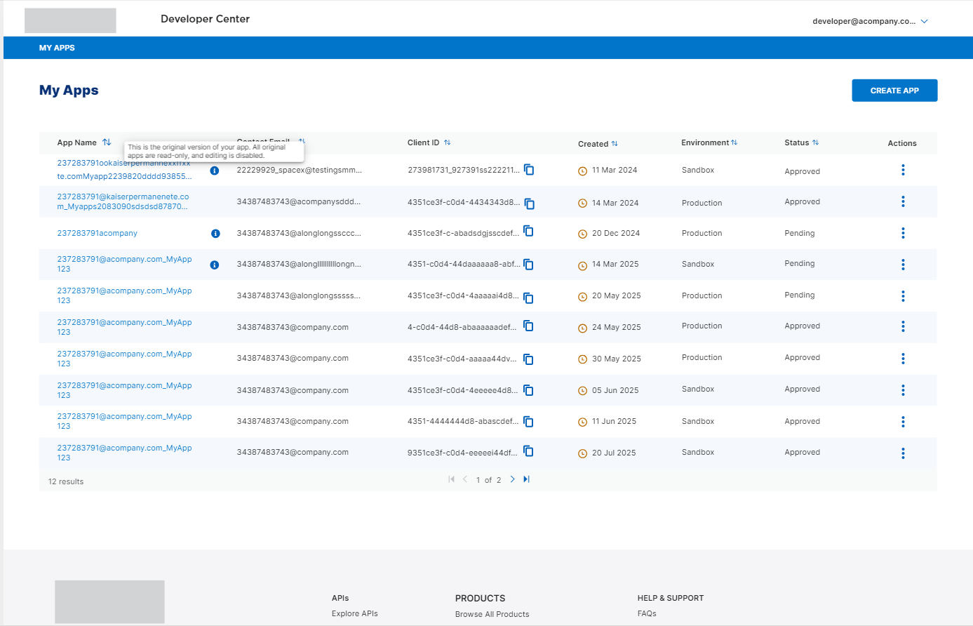
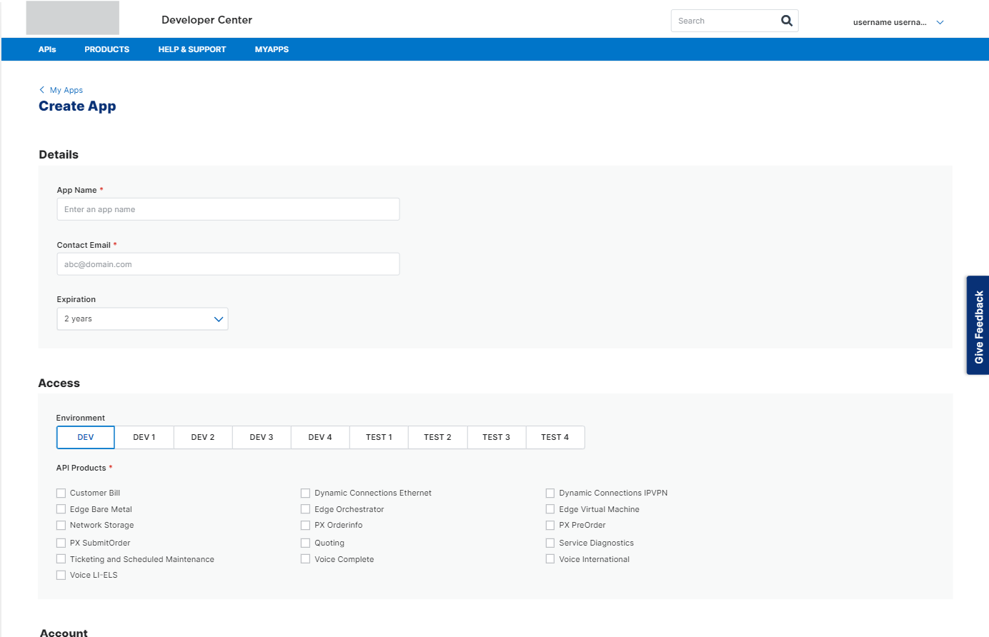
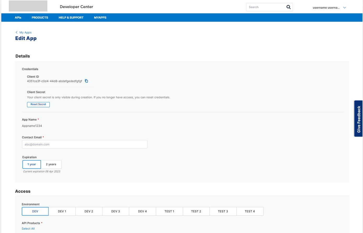
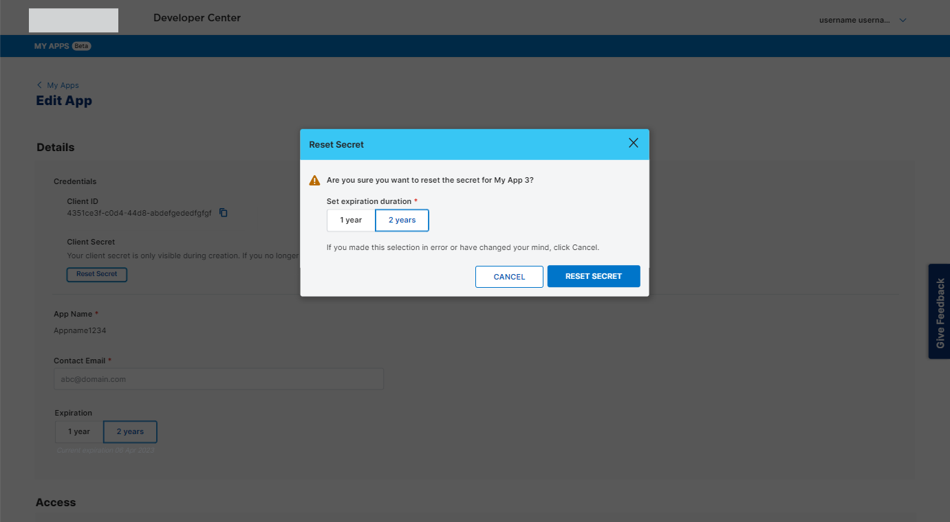
The Developer Center serves as a platform where APIs are showcased, allowing developers to experiment with integrating them into their applications. In this project, I crafted an intuitive and informative MVP developer experience. This included designing detailed pages such as the API library, comprehensive API documentation, 3-column API code reference pages, and developer help documentation. This encompassed both the unauthenticated and authenticated My Apps experiences
My Goal
Emphasizing an API-first approach, a robust developer experience was crucial. My aim as a designer was to deeply understand the developer persona through research, using this understanding to craft a visually engaging and user-friendly Developer Center. Post-MVP launch, our strategy involved iterative improvements, ongoing learning, and the integration of new features to enhance the experience continuously
Client
Developer Center
Role
UX Designer + Researcher
Duration
5 months
Tools Used
UX Pin, User Testing, Miro, MS Whiteboard, Powerpoint
Initial Research
User Interviews
We completed 12 user interviews to gain deeper insights into the developer persona. From these interviews, we distilled patterns to harmonize the overall design and information architecture of the developer center
This process was crucial in prioritizing features due to our tight timeline
Additionally, our research highlighted other prominent developer portals such as Microsoft Developer Center, Github, and Stack Overflow, which our users referenced to gauge industry standards and trends
Key features that emerged as critical to our users included clear and accessible API documentation, comprehensive API error logs, informative blogs, and an active community
Developers wanted quick and easy ways to get to help documentation to troubleshoot
Competitive Research
With these learnings, I researched many developer portals to learn about the most current features, documentation standards, look and feel
Specifically, I was looking to learn about
API reference documentation best practices
Developer Help and Support documentation
Community and Blogs
API Libraries
Visual trends
Key learnings from user interviews and competitive research
Ensuring the API Reference and documentation were easily accessible from any page on the site, recognizing it as the primary reason developers visited.
Making specific APIs easily discoverable within a dedicated API library
Fostering a robust developer community; developers preferred troubleshooting independently or seeking help from peers in a community before resorting to direct support options like "contact us" or chat features
Ensuring help documentation was easily accessible and concise
Establishing a distinct visual language and identity for Developer Portals, tailored to match user personas while maintaining brand identity, which differed slightly from the main brand's dot com site
Implementing site footers as sitemaps, a new pattern for our team but essential for user navigation efficiency according to our persona's needs
In addition to this, I created a robust document of my learnings about developer centers visual language and identity and shared this with stakeholders
I identified significant patterns such as playful iconography, animations, developer themes, and avatars
Armed with these insights, I collaborated with the brand, visual design, product, and tech teams to advocate for our persona and collectively make informed visual design decisions
Feature List and Priority
Based on this research, I compiled a list of essential features crucial for a meaningful developer experience. Additionally, I identified nice-to-have features that were not critical for the MVP.
I then presented these findings to stakeholders, collaborated on finalizing and prioritizing features for the MVP, and added others to our product backlog
MVP
Fully responsive Developer Center
API Library
Product Family Library
API Documentation Pages
3 Column API reference and try it out functionality
Help & Support
Product Backlog
Enhanced Registration and Sign In experience with a unified Identity Management System
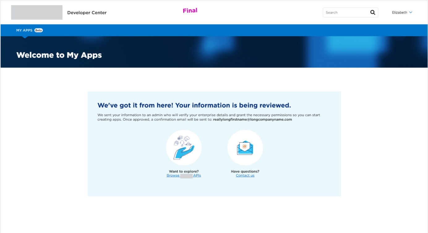
Authenticated My Apps enhancements
My Apps Admin Tool
Developer Blog
Community
Webhooks
SDKs
Tutorials
API Versioning
Design
With a feature list now in place, I started doing some initial sketches to map out the information architecture and layout of the Developer Center
Initial sketches
Global Navigation
After a card sorting exercise with ~9 users and supporting competitive analysis, we divided the navigation into 3 parts-
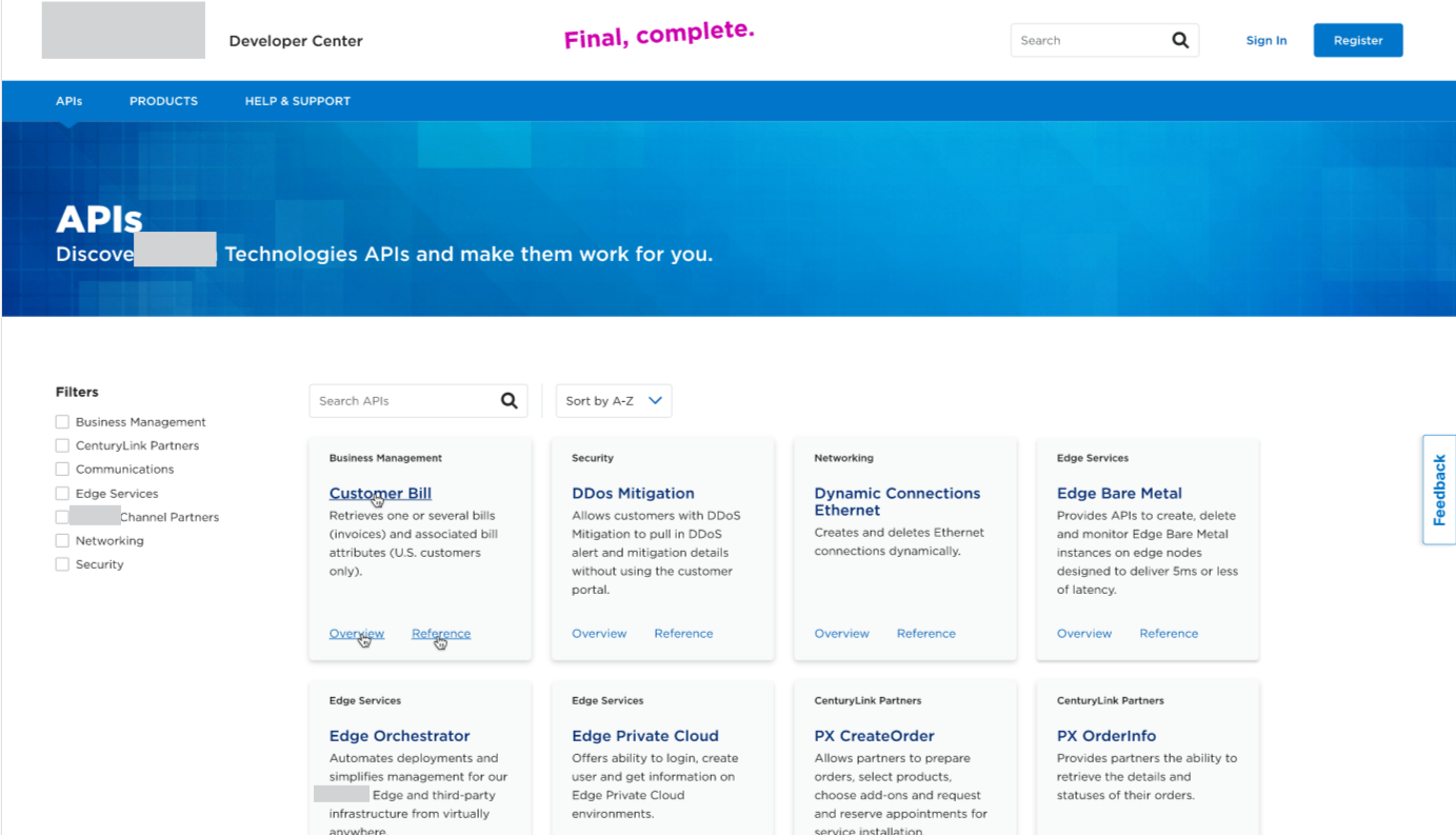
APIs: This is a comprehensive library of all available APIs. Since the primary goal of our users on the site was to explore APIs and their documentation, this was the first item on the nav bar
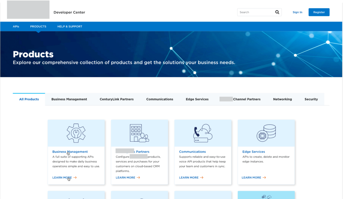
Products: Even though the developers were our primary persona and user, we also learned that users from the product side and other executives (non-developers) were often involved in the decision-making for procuring APIs and they often looked for product families. So this was an easy way to browse APIs product family-wise. This also allowed us to have dedicated product pages so we could add use cases, tutorials, SDKs, and other developer tools here as we continue to grow and iterate
Help and Support: We had learned in our research that our persona valued structured help documentation, so we came up with a robust FAQ section, apart from other help documentation so we can make it easy for developers to troubleshoot themselves before contacting us. The long-term vision here was to add a blog and developer community so developers could learn from each other
Mid Fidelity Wireframes
Even though this was early in our design process, I collaborated closely with visual designers and copywriters to establish estimated character limits and visual image proportions for integration into the wireframes. This was crucial given our pressing deadlines.
A notable point is that several components, such as API tiles and product tiles, did not initially exist within the enterprise style guide and library. Recognizing the importance of these components in aligning with our persona and the site's primary objectives, I advocated for their inclusion in the design library. These styles subsequently became integrated into various other facets of the enterprise experience as well.
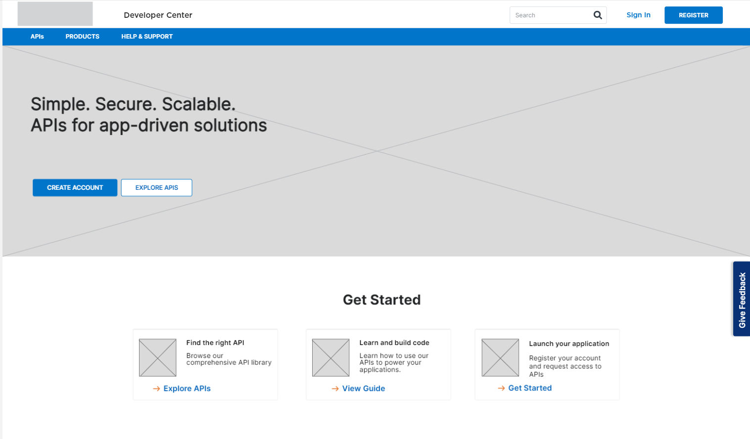
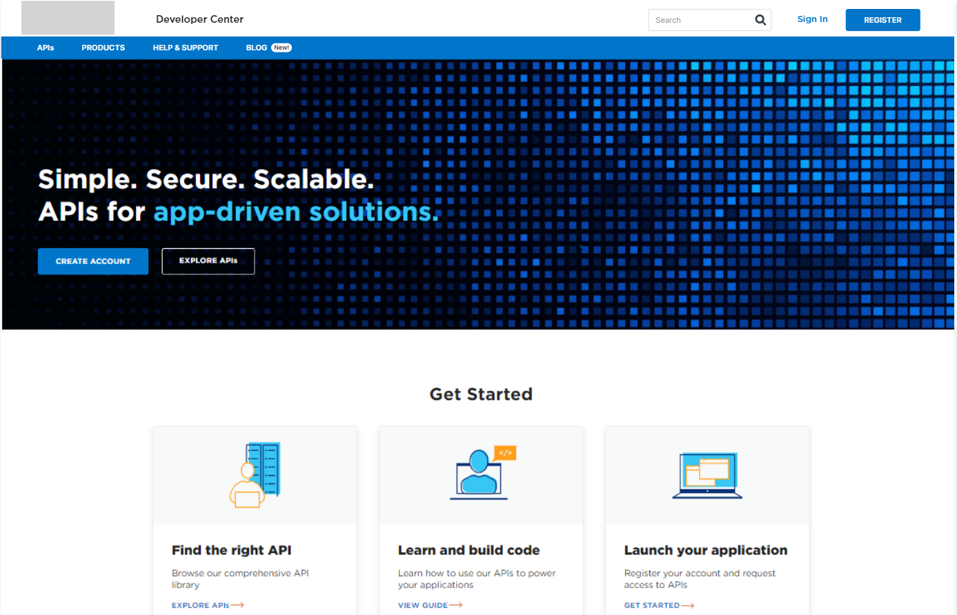
Homepage

API Library

Product Landing Page
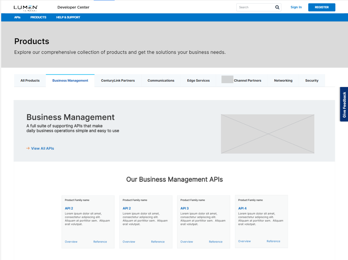
Dedicated Product Page
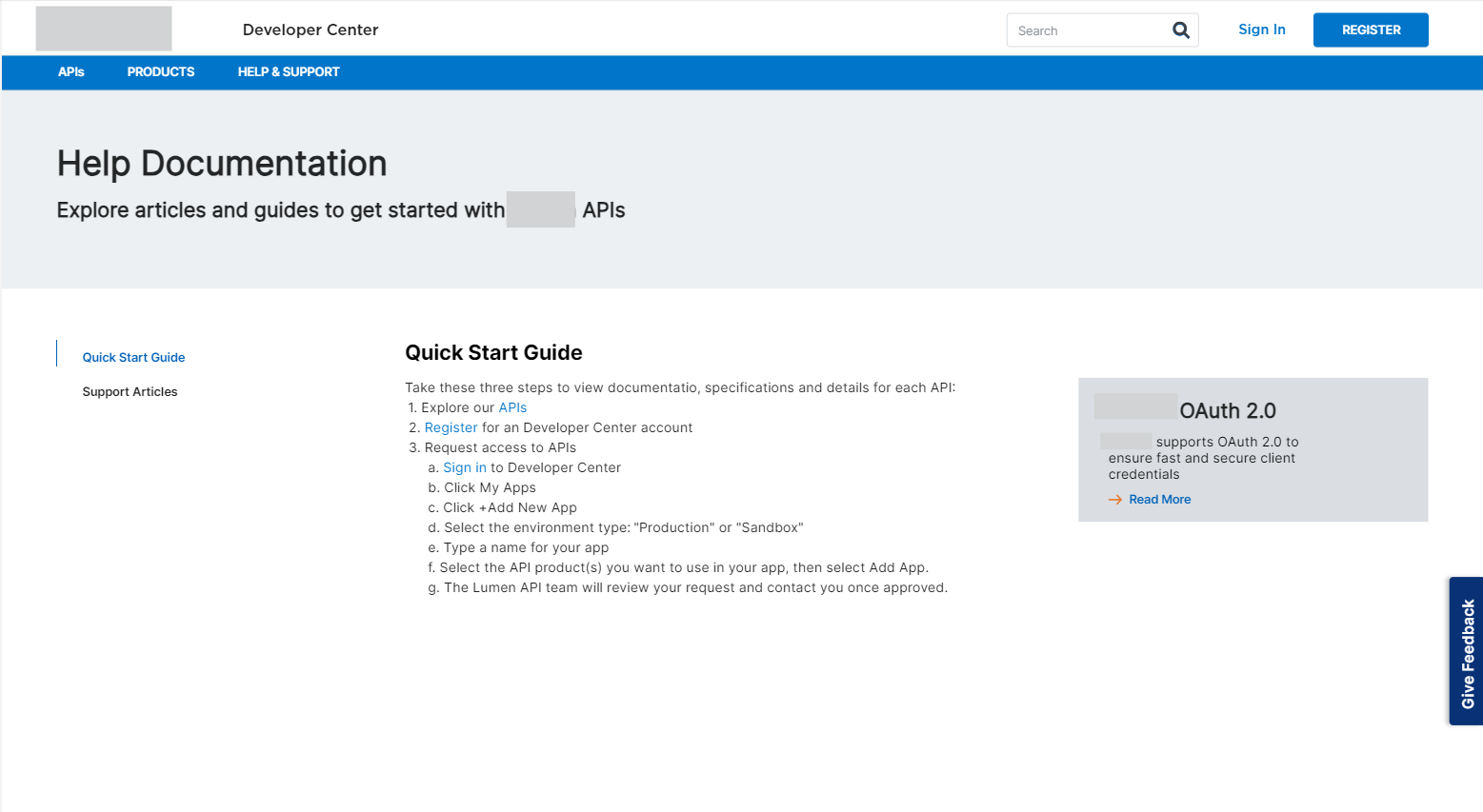
Help Documentation

Search Results
Usability Testing
At this step, we did some testing on a fully interactive mid-fidelity wireframe with 12 developers using the user testing platform to understand
If APIs and their documentation were easy to find
The site navigation was easy to understand and use
In case they ran into issues, that help was easy to find as well
All 12 users were able to complete all the tasks that were given successfully
The API tile was a very important part of this step, especially the description it contains as well as the addition of quick links to API reference and documentation.
API Reference 3 Column Design
Once I validated the overall discoverability of the site, I moved to design the 3-column API reference experience. This was the most challenging part of this design process. The complexity of YAML files, lack of consistency in YAML documentation from API to API, and lack of API constructors having a unified way to document APIs, schemas, code and descriptions were some of the challenges that I had to design with
Mid Fidelity 3 Column API Reference Design
The 3 column layout was divided into
Left navigation for the user to look through multiple YAML files and their respective endpoints
2nd column had static values like schema, sample values of headers and parameters, and information on error codes
The 3rd column was the interactive column where the developer could enter sample values to try out the API
Left Navigation design thinking
Here I had to think about the extensibility of the left navigation considering the complexity of single and multiple YAML files for different APIs
2nd and 3rd column design
Here I had to think about the behavior of the 2nd and 3d columns while the user navigated the left nav and also how this would render on mobile and tablet, even though 96% of our users accessed the developer center on either a laptop or a large desktop

Desktop
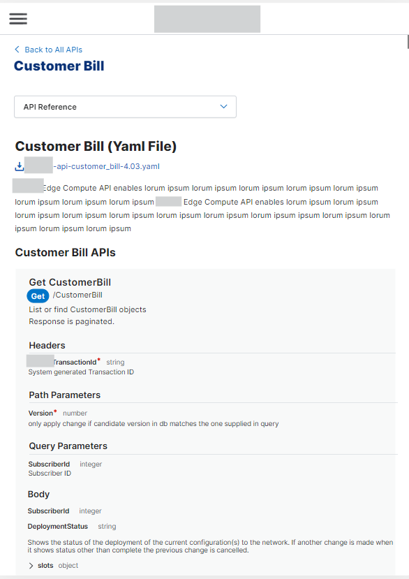
Tablet
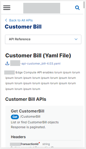
Mobile
Usability testing on 3-column API reference layout
We conducted usability testing of the 3-column reference layout with 10 users. 8 successfully completed the task of locating a specific endpoint and experimenting with code. Our findings highlighted valuable insights into the usability of the left navigation, the second column, and the third column. Details of these insights can be found below
Feedback on the overall layout
Usability testing for the 3-column API reference led to learning that developers expected and used a wide screen to view API documentation and try out code. Till now we had been designing for a laptop at 1256, but we now pivoted to a large desktop at 1728 pixels which gave us more room for the 3-column design
Feedback on the left nav, 2nd, and 3rd column

Adding a link to show more content for lengthy YAML file descriptions that pushed the 3 column layout down

1st column: Enhancing the behavior of the left navigation like keeping user selection active while user browsed other folders

2nd column: Adding a prominent "required" in red instead of the asterisk after developers found it hard to locate the required field and wanted to quickly fill out these fields to be able to use the "try it out" functionality. Also keeping the optional fields collapsed as default.
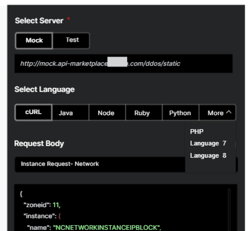
3rd column: Addition and support of multiple languages (this was added to the backlog as it required backend solutions and investment)
Next Steps and launch
While we were able to incorporate designing the entire site for a larger desktop, the other 3 column research findings and enhancements were unfortunately not incorporated as development has already built most of it while research and iteration were ongoing. This was due to a very tight deadline. We placed this in the product backlog and prioritized part of it as we gathered more insight
Another time-sensitive issue we were trying to work through was legal and visual approvals for our graphic and copy so they aligned with the dotcom.
After this, my next focus was to UAT the site from a UX and UI perspective. This was an intense process because the inconsistency of YAMLs showed up on our 3 column reference pages and we had to quickly pivot the design of some sections like the schema to ensure correct and complete rendering
Even though it was an intense lead-up to this launch, we were able to deliver the MVP on time
With this new Developer Center, our monthly customer API calls increased from 4 million to 44 million
We also scored a System Usability Score of 80 for the Developer Center
Hi Fidelity Visual Mock-Ups
Here you can browse some high-fidelity visual mocks that were delivered to development. A fully interactive prototype was also delivered.


