Koa: Research and design solutions for a Kenya based fintech
Stakeholders
Product Manager + Product Designer at Koa
Role & Team Structure
UX Researcher and Designer
Collaboration with 2 team members
Duration
3 week sprint
Tools used
Figma, Notion
Project Overview
Koa is a new app, launched in 2021, and wants to gain the user’s trust. In this project, we wanted to understand what the Koa users valued, what motivates them, and what trust meant to them. Then, we wanted to create design solutions that addressed these insights in order for Koa to become a reliable and trusted app in Kenya for setting and achieving financial goals and saving money.
Stakeholder Goals
Conduct in-depth research to be able to understand user pain points
To improve onboarding and goal setting based on the research.
Usability Testing
Constraints or Opportunities?
Learning and understanding a new market
8-hour time difference
Access to users
Access to the current app
DISCOVER
Research Plan
User Surveys
Responses: 8
Posted on Koa’s Twitter and Facebook, Reddit, other Facebook groups
Telegram Channel
Unique feedback points: 46
Studied and synthesized data from the Koa customer support Telegram channel
User Interviews
Total users interviewed: 7
Interviewed via google meets and WhatsApp video and voice calls
Competitive Analysis
Dash, M-shwari (direct)
Acorn, Digit, Lemonade (US Based)
SWOT analysis
1. User Survey Findings:
Top expectations were convenience, security and privacy, and transparency
Top motivations were savings and investment plans offered, interest rates offered, and the ease of use
Trust meant Transparency, Credibility, and Security to users
2. Telegram Channel Findings:
Our only initial access to users was through Koa’s community of Telegram users. The telegram channel is one of the avenues that users come to clarify, complain or seek more information. We had 46 unique feedback points. This led to some interesting insights and starting points to begin our research on Koa’s pain points-
withdrawal
transfers
referrals
interest rates
Things to note here is that the users not only wanted to know the timelines but also how each one of these processes worked and looked? So not only the whens but also hows and whys…
3. User Interview Findings:
There were clear themes that emerged from the interviews…
Users wanted to get the big picture information on processes and progress
Users wanted personalization
Users wanted proactive and clear communication
Seeing progress once they set specific goals motivated them to save more
Users trusted Britam and that helped build trust with Koa
4. Competitive & Comparative Analysis
Features
While we studied the features for M-Shwari, Dash, Digit, and Acorns…
We found that both of Koa’s direct competitors had instant withdrawals and M-Shwari had a no-fee withdrawal, which brought even more focus on the earlier pain point on information and clarity about the withdrawal process we gained from the Telegram channel.
We also realized that Koa is also the only app, focussing on financial literacy (apart from Africa’s Pocket which was mentioned by some users)
We also found that while Koa has several customer support channels outside of the app (WhatsApp, Telegram, etc), the in-app chatbot/ live help was missing and that led to users either exiting the app or reducing usage
SWOT Analysis
After we had a better understanding of the competitive landscape, we were able to do a SWOT analysis for Koa
From all the research we understood the 4 most important goals for the Koa users…
DEFINE
Once we had a clear idea of what the Koa user’s likes, dislikes, needs, and values were, we were excited to create a persona that we would design for!
Meet Kelvin!
Rooted in our user research, we formed some storyboards that visualized Kelvin’s pain points- withdrawal, transfers, and referral program. The pain points of all were the same.. feeling frustrated due to mixed communication and unclear timelines.
Let’s look at Kelvin’s withdrawal experience on Koa here ⇩
We defined Kelvin’s problem…
Kelvin wants to understand how each feature within the app works so that they can make informed decisions about saving money towards their goal while staying motivated to keep saving. He wants to ultimately build trust and confidence knowing their money is safe when using the Koa app.
How Might We?
How might we build trust with Kelvin?
How might we improve communication with Kelvin on Koa?
How might we motivate Kelvin to create and meet goals on Koa?
How might we inform Kelvin of withdrawal and transfer timelines on Koa?
How might we personalize the Koa experience for Kelvin?
Once we were clear and understood Kelvin’s needs, we were excited to move on to the design phase of this project!
DESIGN
Design thinking
Planning the solutions
Sketches
Design Studio and iteration
Prototypes
Wireframing, mid and hi-fidelity prototypes
Usability Testing
?
Challenge
By the time we reached the design stage, we were 2 weeks into a 3-week sprint. We had to re-evaluate and see if we would have time for usability testing, considering the time difference, a tight timeline, access to users’ screens remotely. While the interviews could be conducted via a WhatsApp call instead of zoom, usability testing came with its own challenges. We had to set expectations with the stakeholders about what the deliverables will be and worked around this problem to make sure our solutions reached the testing stage, even though the sprint ended. I will speak more about this in the DELIVER stage…
Design Strategy and thinking
Both we and our stakeholders were excited about the research we had conducted so far. We now had to plan out our designs so we were able to address each pain point in a simple, executable, and intuitive way. I am excited to share with you each design solution and our thinking behind it. From our research, we had identified the four main user needs which were
Building Trust
Motivation
Clear and Proactive Communication
Personalization
Building Trust: Onboarding
We came up with two design solutions for this:
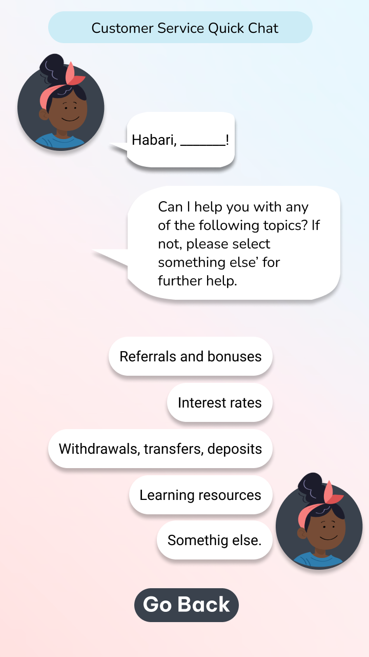
Chat Bot onboarding and customer support
Trusted partners screen addition to onboarding carousel
1. Chatbot function for onboarding as well as a chatbot for in-app customer support :
The reasoning for this was to ease the sharing of sensitive data such as KRA pin, as well as a more personalized and conversational approach for users. The stakeholders liked the idea and found it innovative, however, once we built this out, and shared these with them, they realized that there were technological constraints and challenges currently due to which this wasn’t a solution that was viable “for now”. They would be working on it for the future.
2. Trusted partners screen addition to onboarding carousel
We found in our research, that even though Koa was a new App to Kenya and still was working on building trust, 100% of the users interviewed trusted Britam, and some had mentioned that they decided to join Koa, because they heard through a friend that Koa partnered with Britam. While this information is readily available via google and Koa’s website, it isn’t shown on onboarding. We added a screen of trusted partners to the onboarding carousel to inform users upfront about Koa’s trusted partners such as Britam. This was a “now” solution and was very well received by our stakeholders
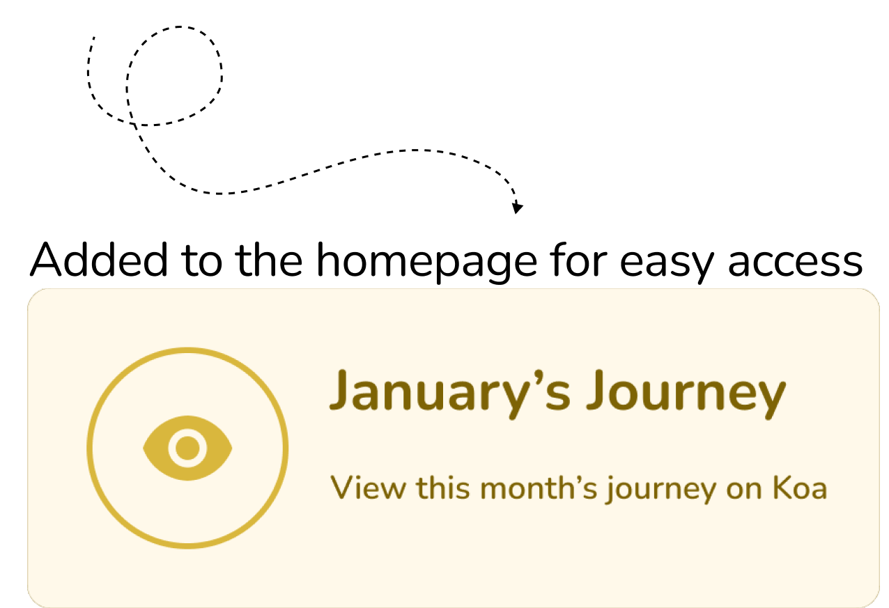
Motivation: Monthly Financial Journey & User Savings Journey
1. Monthly Financial Journey:
There was no monthly summary of users’ savings, experience, and activity on Koa. Users had expressed that seeing a big picture of their savings would motivate them to save every month and set more goals. It is accessible from the homepage and it includes Monthly total savings and interest earned, snapshots of referrals earned, goals reached, deposits made, customer care queries. The stakeholders were also excited about this.
2. User Savings Journey:
This feature allows users to take a look at their savings goal from a big picture perspective within Koa. This would also encourage users to continue saving and create new goals.
Clear and Proactive Communication: Informational Journey Roadmaps
This feature helped address frequently asked questions from users and gave them the big picture of the process. Instead of the users getting frustrated and looking to information from customer care or FAQs, we synthesized the main points of information into a scroll and brought it to that specific action. The stakeholders were really excited about this idea and it was also something that could be implemented in the “now”.
1. Informational Journey Roadmaps:
We incorporated a clickable link that explains the step-by-step process and timelines for earning a referral bonus. Similarly, the informational journey roadmaps were created for withdrawal, savings goals, and one explaining quick save vs goals.
Personalization: Customizing notifications
1. Customized Notification settings
There is currently no way to customize notifications on the Koa app. Users wanted push notifications that would help remind them to deposit into their savings, updates on when their friends joined Koa, and timeline updates associated with their withdrawals, transfers, and deposits. The Koa homepage had pending items on it, and creating this feature it would reduce the clutter there. We built a slide-up overlay to explain what each notification meant.
Once we had design solutions that solved for all of the user needs and pain points that we had identified with our research, we moved to the handoff/ deliver stage…
DELIVER
Apart from our research and design solution prototype, we also delivered a style guide as well as a usability testing guide for each solution
Koa Style Guide
We created a style guide for Koa using the resources given to us as well as by studying their current app. This includes colors, typography, iconography, and illustrations!
Usability Test Tasks
As spoken to earlier in the design stage, we did not get to usability testing, so instead, we planned out all the tasks for each design solution on our Figma file and handed it over to our stakeholders so that these solutions could move on to be tested. I am sharing some of our tasks and how they were laid out…
And finally, explore the prototype below!⇩
Learnings and Insights:
Working with a completely different market and people was a unique and insightful opportunity, not only in learning from them but also to collaborate and empathize, with their problems, outlook, and perspectives. I am so very grateful that I had this opportunity! Here are some of my learnings…
To listen and prioritize what the business and users needed “now”. The information journey maps, even though were simpler solutions than the chatbot, would solve current problems of user hesitation and confusion.
Even though the stakeholders were very excited to implement some of the design solutions, we were not able to conduct usability testing, which was one of the stakeholder’s asks. However, to be able to pre-empt our reduced deliverables, communicate them and thus adjust the expectations of the stakeholders was one of the best learnings.
Problem-Solving and being able to see how to move the process along with what resources we had, instead of waiting for others or ideal ones. The case in point is the amount of insight we were able to gather from the telegram channel, much before a single user interview was conducted.


